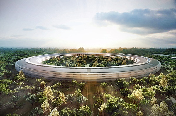
A couple of weeks ago, the Cupertino City Council approved the long-awaited, 3.2-million-square-foot Apple Campus 2. Approval means that the building, notable for its purely circular footprint, is to arise on an open field north of Interstate 280, with completion expected in about two years. Designed by architectural luminary Sir Norman Foster, the main office building is notable for a purely circular footprint. Both Apple and the architect suggest that the horizontally oriented, four-story building will be gentler on Gaia than a tall building. The campus, which is roughly four times larger than Disneyland, will include additional buildings for a gymnasium and a 1,000-seat auditorium; the latter is the only public venue on the 275-acre site. Even if the landscape scheme does not coordinate with the building designs in any obvious way, the site plan is positively fuzzy with greenery, so that is another plus.

On one level, the circular building – which was personally unveiled by its principal proponent, the late Apple Chairman and Co-founder, Steve Jobs, about 18 months ago – is a continuation of the elegant, minimalist design esthetic that has made Apple a consistent standout in industrial design. It's hard not see the building as a kind of overscaled funerary monument to Jobs. Immense, solemn and symbolic with a capital "S," the new Apples headquarters is reminiscent of the "The Cenotaph of Newton," a monumental scheme by the French architect Etienne Boullee (1728-1799). Never built and probably impossible to construct, the Centotaph consists of an immense empty globe, topped by a dome larger than that of the ancient Pantheon in Rome. So the new Apple office building is the Cenotaph of Steve, with some of the arrogance and visionary power of the Apple co-founder finding expression in this impressive, if ultimately irrational design.
Architects love circular floor plans, in part because of the "infinite" or endless nature of the circle. The Romans built circular "tempietti" as well as the super-sized Pantheon. Much later, in the Italian Renaissance, architects became obsessed with the idea of designing circular churches, even though the circular floor plans did not accommodate themselves easily to the ceremonies of the Catholic Church, and were rarely built. Even more recently, circles beguiled that great genius -- and even greater crank -- Frank Lloyd Wright, who relied on circles in several of his latest, most eccentric buildings, such as the Guggenheim Museum in Manhattan. One major difference between the circles in Renaissance design and the Apple campus is the Renaissance conceived circular spaces that were active, important places. (Many of the schemes place the church alter at the center of the circular plans.)
One possible advantage of the circular plan is a continuous interface with the outdoors. Yet there is something empty about the garden scheme, at least as it stands: Rather than being a destination in itself, the center of the doughnut hole is negative space; it is an awkward condition to be mitigated. While Apple office workers will likely take advantage of the building's design to frequently spend plentiful time outdoors (and this is a big win), few will stray to the center of the doughnut hole. There's no reason to go there. It's an empty precinct filled with trees, or a type of "greenwash."
Curved spaces may not be better than straight corridors for most people. If long straight corridors are tiresome to walk, are curving corridors less frustrating? Curved hallways lack a visual endpoint, which is part of the way that we orient ourselves in space. Plus, most of us prefer to walk in a straight line, which is, after all, the shortest path between two points. Perhaps the doughnut is so large in scale that entire departments can all work together, all within the same view shed, without the desks of coworkers curving off into the unseen distance. If the building is meant to encourage communication among people working in different disciplines inside the same building, however, the circular design seems to works against that goal. Some renderings of the office building interior depict an internal monorail system to deliver workers from one point to another within the circular periphery, which speaks to the difficulty of getting from A to B in this very large building.
By the by, we noticed that the approval of the new Apple HQ was somewhat overshadowed by the Congressional vote the same day to re-open the federal government. Apparently, there was a train wreck with a really bad website that was trying to redistribute wealth to minorities by providing health care to sick people, or something like that. I wasn't paying attention. Anyway, some of our readers would like to know more about the new Apple headquarters, so we are providing the following Frequently Asked Questions (FAQ).
Question: In what way is the U.S. Congressional delegation similar to the new Apple headquarters?
Answer: They are both big zeroes.
Q: In what way do Congress and the Apple HQ differ?
A: Congress is a waste of time, while the Apple HQ is a waste of both time and space.
Q: What is the role of landscape in the form of this immense building?
A: Uh… none. Why do you ask? Is that important?
Q: How can such an immense building fit harmoniously with the rest of the surrounding city?
A: What city? Do you see a city? (peals of laughter, followed by a sharp elbow to the ribs.)
Q: What does this immense monolith say to the people who work in it?
A: "You miserable little ants! Watch out I don't step on you!"
Q: What does this circular oddity say about the late Steve Jobs?
A: Overcompensation for his inability to throw a Frisbee?
Q: How shall this building be known in the popular imagination?
A: Maybe as Steve Jobs' Circle Works?

